Tokyo University of Foreign Studies Logo and University Color
On the occasion of the 150th anniversary of the founding of TUFS in 1873, the symbol mark and logo of TUFS have been revised to symbolize a new beginning based on our long history and traditions, and to carry on the image that has been familiar to students up to now. In conjunction with this change, we have established a new set of "Visual Identity Guidelines" that stipulate regulations and rules for the use of these visual elements.
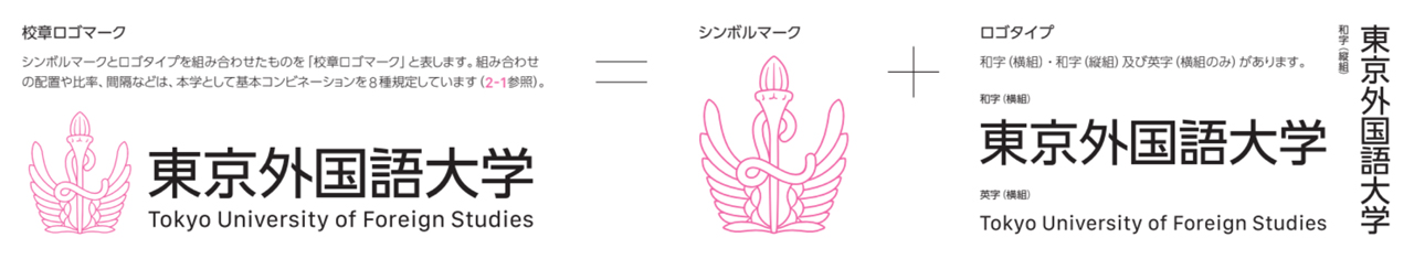
Visual identity (VI) is a visual representation of the university's ideal image, philosophy, vision, and school culture, etc. The symbol mark, logo, and school colors are the main elements that make up VI. VI forms a visual unity when used correctly in the prescribed manner.
In the event that changes or the addition of new items become necessary, these guidelines will be revised and upgraded as appropriate. In order to develop the VI of TUFS without damaging its value, please refer to the usage methods listed in this guideline to use them effectively.
Visual Elements
The school logo mark, symbol, logo and school colors (university colors, undergraduate and graduate colors) are defined below.

Symbol Mark
Origin of the Symbol Mark
Gaikokugo Gakko (School of Foreign Languages) was established in 1897 as an affiliate of Tokyo Koto Shogyo Gakko (Tokyo High School of Commerce). In 1899, the School of Foreign Languages was separated from the high school and renamed Tokyo Gaikokugo Gakko (Tokyo School of Foreign Languages). The School’s Principal at the time, Naibu Kanda, and the board members were responsible for deciding the school’s crest. They chose the torch to symbolize illuminating the world and the “L” as the first letter of the Latin word “lingua”, meaning “language”. The wings on both sides are said to represent the School’s departments, which initially numbered eight.
Revised symbol mark
In the revision of the logo, the motifs and the feelings behind the motifs were firmly retained, but were brushed up by incorporating modern interpretations with reference to past expressions. Specifically, we have improved the depiction and balance of the flame and torch base, the way each wing bends, and the treatment of the wingtips. For the L, the curvature of the start, roll, and end points were precisely adjusted to express the attitude of our university, which is more open to the outside world. At the same time, the details have been arranged so that the logo can be used in a variety of sizes, applications, and media.
Logo
History of the name
The school was founded in 1857 as the Bansho Shirabesho (Institute for Research of Foreign Documents) by the Edo Shogunate. Tokyo Gaikokugo Gakko (Tokyo School of Foreign Languages) was founded in 1873 and then merged with Tokyo School of Commerce (later Hitotsubashi University) in 1885. In 1897, Gaikokugo Gakko (School of Foreign Languages) was reorganized to be a foreign language school affiliated with Tokyo Koto Shogyo Gakko (Tokyo High School of Commerce). This school gained independence and became Tokyo Gaikokugo Gakko (Tokyo School of Foreign Languages) in 1899. In 1944, the school was reorganized as the Tokyo Foreign Affairs School, and in 1949, with the enactment of the National School Establishment Law, Tokyo University of Foreign Studies was established as a four-year university. The new university was intended to provide not only conventional foreign language education, but also research and teaching of "foreign languages and the general culture based on them," and to deepen understanding of various regions of the world through language. Accordingly, the English terminology was changed to "Foreign Studies'' instead of "Foreign Languages," which had been used in the Tokyo Gaikokugo Gakko era.
Revised typeface
The typeface used to write the university name has become familiar to faculty, staff, and students, as it has been used in the signage system on the Fuchu Campus. For the new font, the basic design of the typeface was retained, while the details were refined to ensure readability in a variety of sizes, applications, and media, as well as to balance the symbol mark.
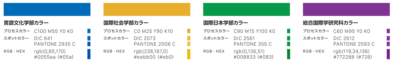
School colors (university colors, undergraduate and graduate school colors)
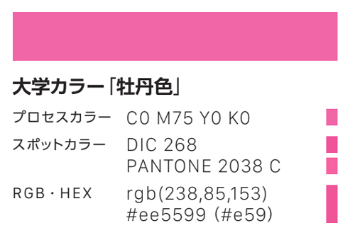
Origin of the university color “Peony”
The origin of this color dates back to the Taisho period (1920). At the request of the Japan Amateur Rowing Association, member schools registered their school color. The color peony was chosen as our school color. Since then, this color has been symbolic as the color of TUFS.
Use of the “Tokyo University of Foreign Studies School Emblem Logo”
Tokyo University of Foreign Studies (TUFS) has established standards for the use of its symbol mark, logo, school emblem logo, which is a combination of the symbol marks and logo, and school colors in order to create a sense of visual unity. Please follow the "Visual Identity Guidelines" when using the school emblem, logo, etc.
Contact Us
Public Relations Management Office, Tokyo University of Foreign Studies
(Contact: Public Relations Division)
Email: koho[at]tufs.ac.jp (Please change [at] to @)